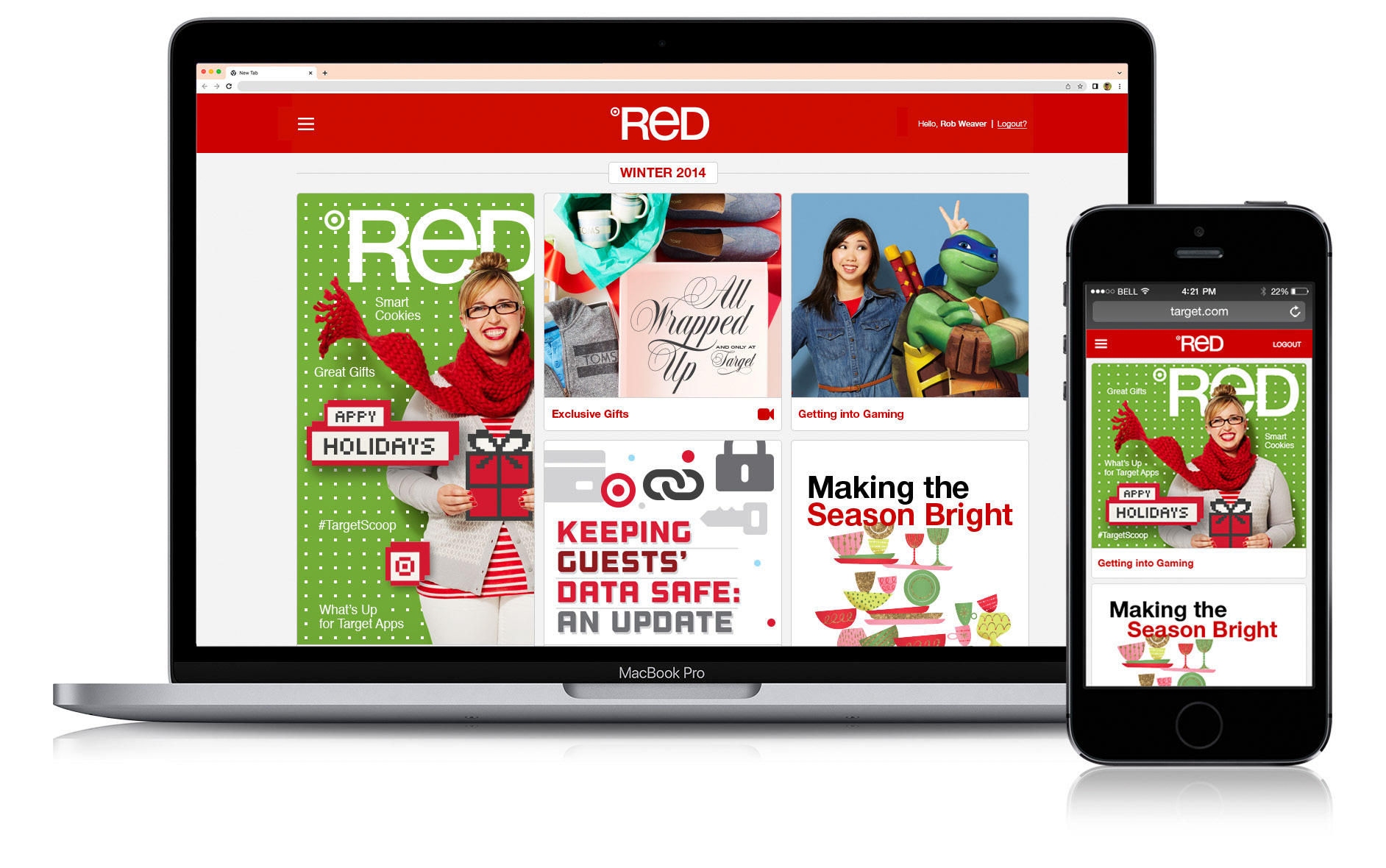
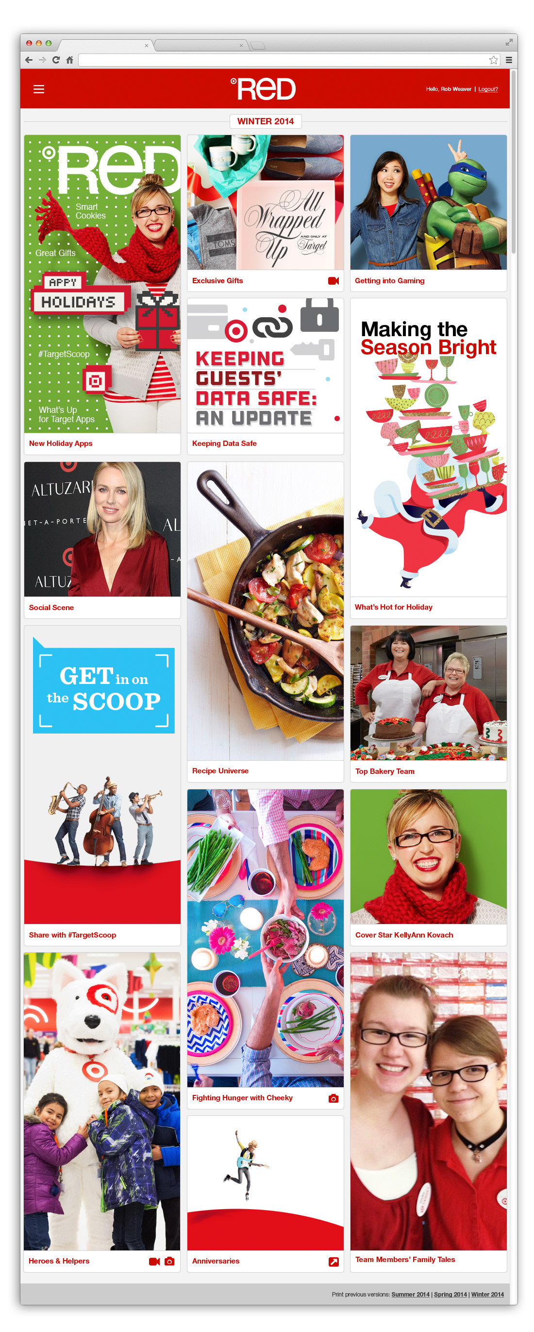
The Digital Red landing page displayed all of the article's from that season up front and easily accessible as thumbnails in a "Masonry" style layout whereas in the previous version (pictured at the bottom of the page), one would have to flip through to see the articles.
Once a team member clicked on an article thumbnail, they would be taken directly to that article page. From that page they could easily navigate back to the landing page or click forward or backward between articles.
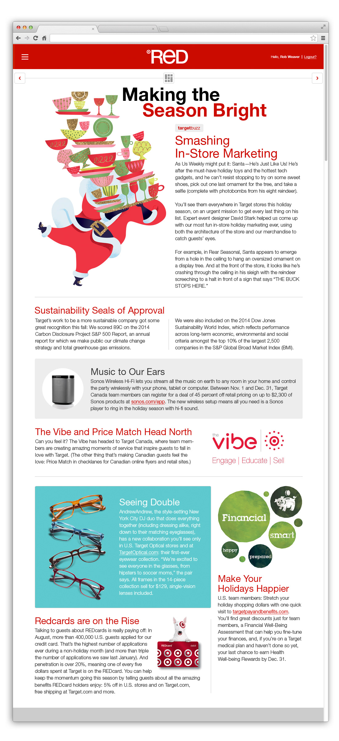
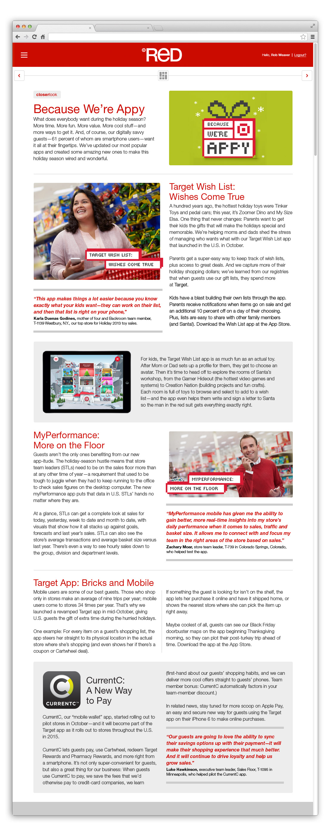
Since some of the articles contained a lot of content, we wanted them to keep the reader engaged so I broke the content up into smaller, easy-to-consume sections and used graphics, font styles and colors to make it a more digestible and enjoyable experience while maintaining consistency throughout the website.
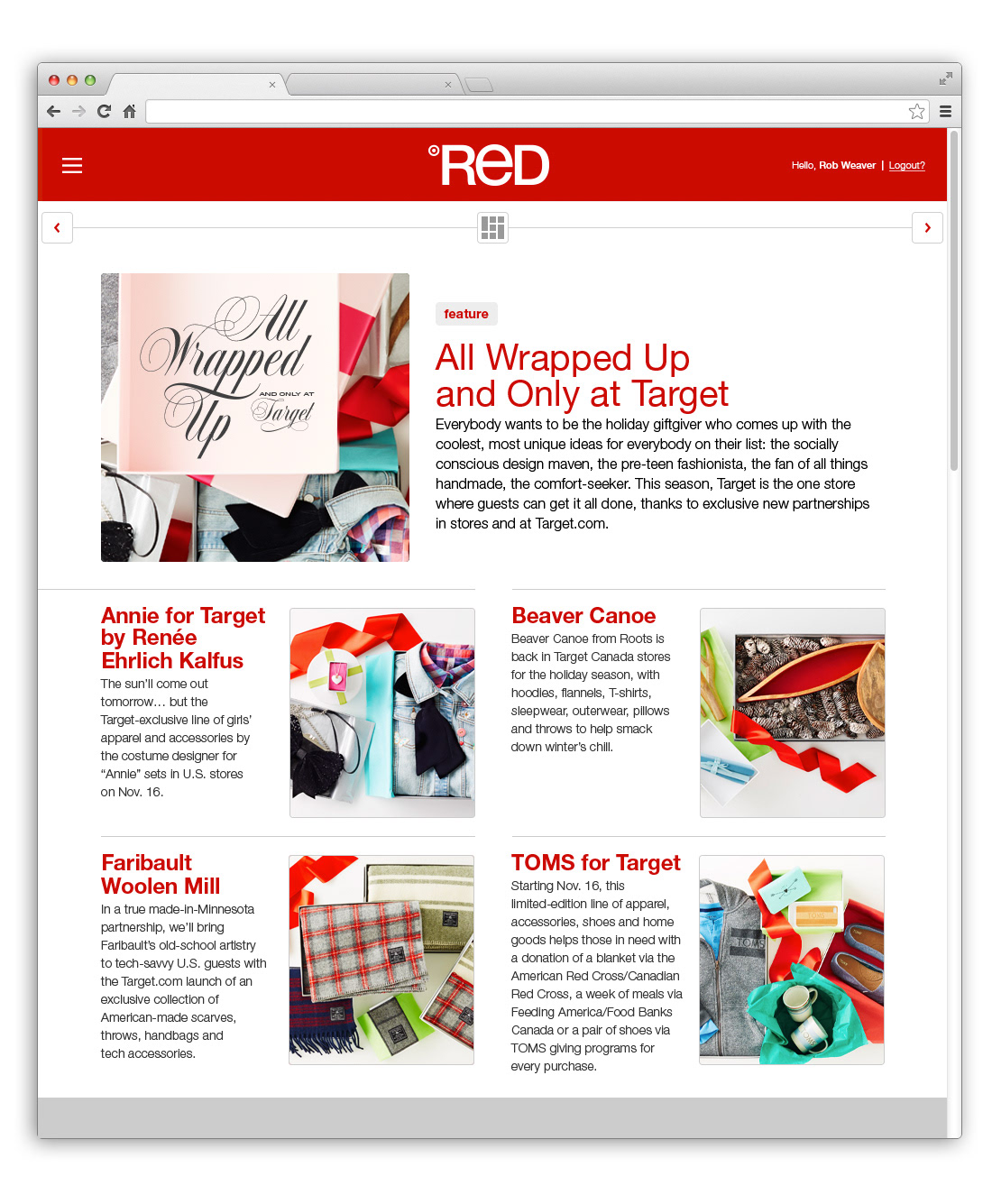
Not all of the articles were full of thousands of words. For the smaller articles I still formatted content into sections in a way that made the most sense while incorporating visuals to keep the team members engaged.
Our Information Architect developed these low-fidelity wireframes which gave us a good starting point to work from and as you can see in the article wireframes, we ended up taking the design a step further by really making the articles have more flexibility with the content.
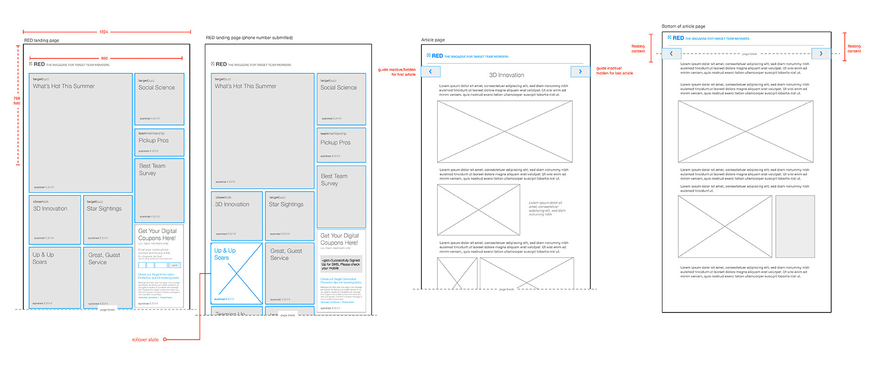
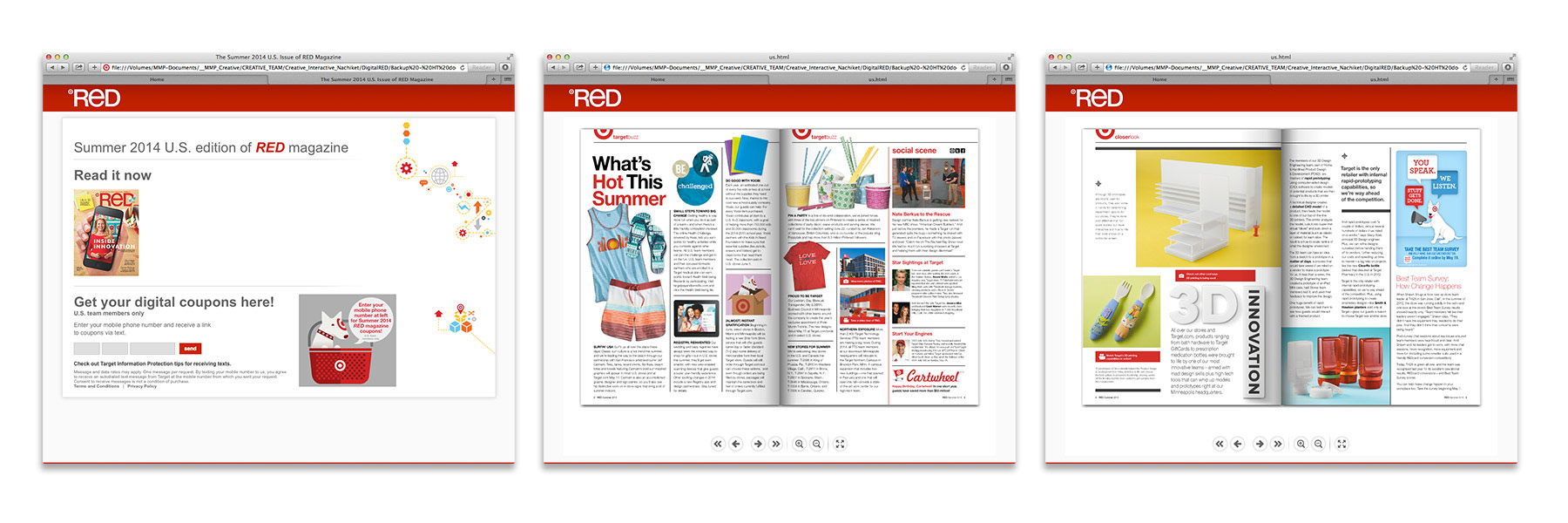
Below is the previous version of the Target Digital Red Magazine. Though this "Flipbook" method provided the familiarity of the print version for the reader, there were many opportunities that needed to be addressed.