Program managers would get lost in a web of information on the previous GiftCard program site so they would often turn to competitors such as Walmart and Amazon for ease of experience. We wanted to make a familiar website stand out in a new way and make Target Gift Card top-of-mind or all their loyalty and incentive needs.
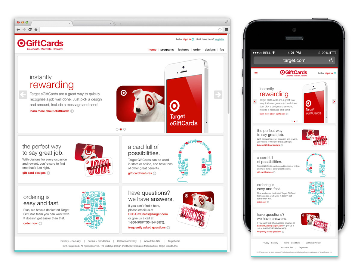
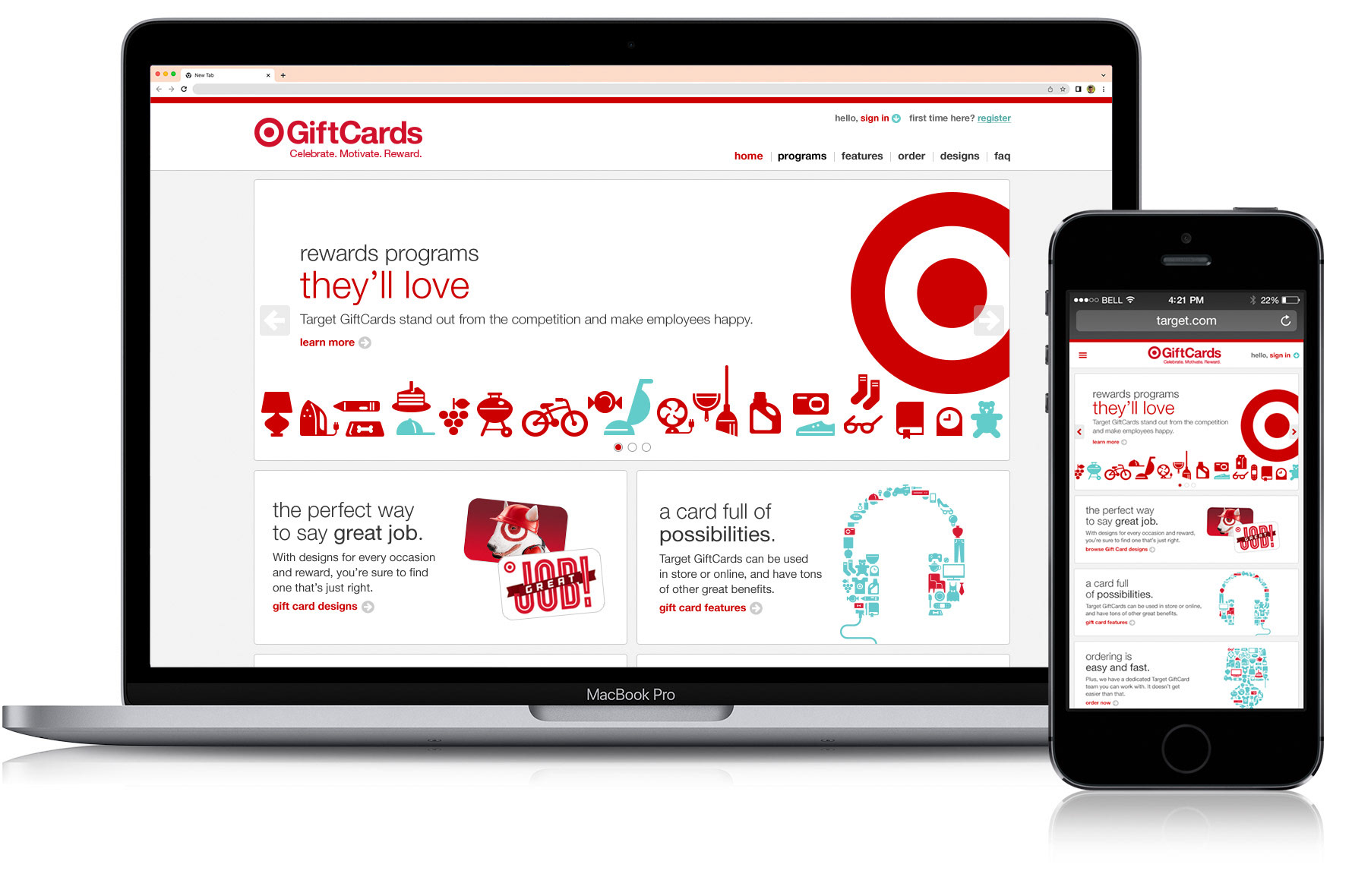
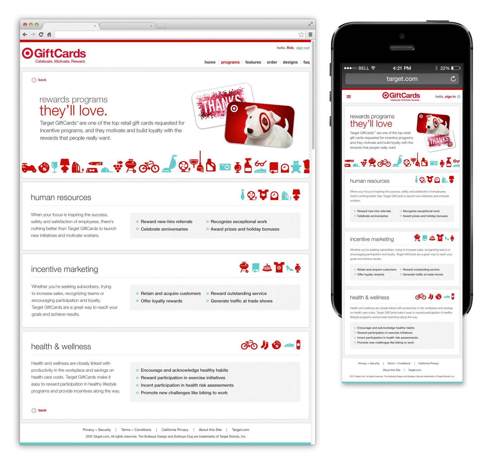
The solution was to make the B2B website an easier, more compelling experience for the guest. Creating a multi-channel platform that gives the end-user flexibility with access in their hands and on-the-go.

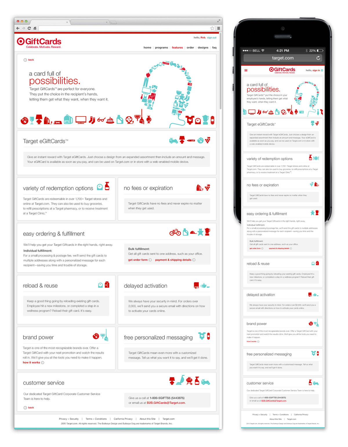
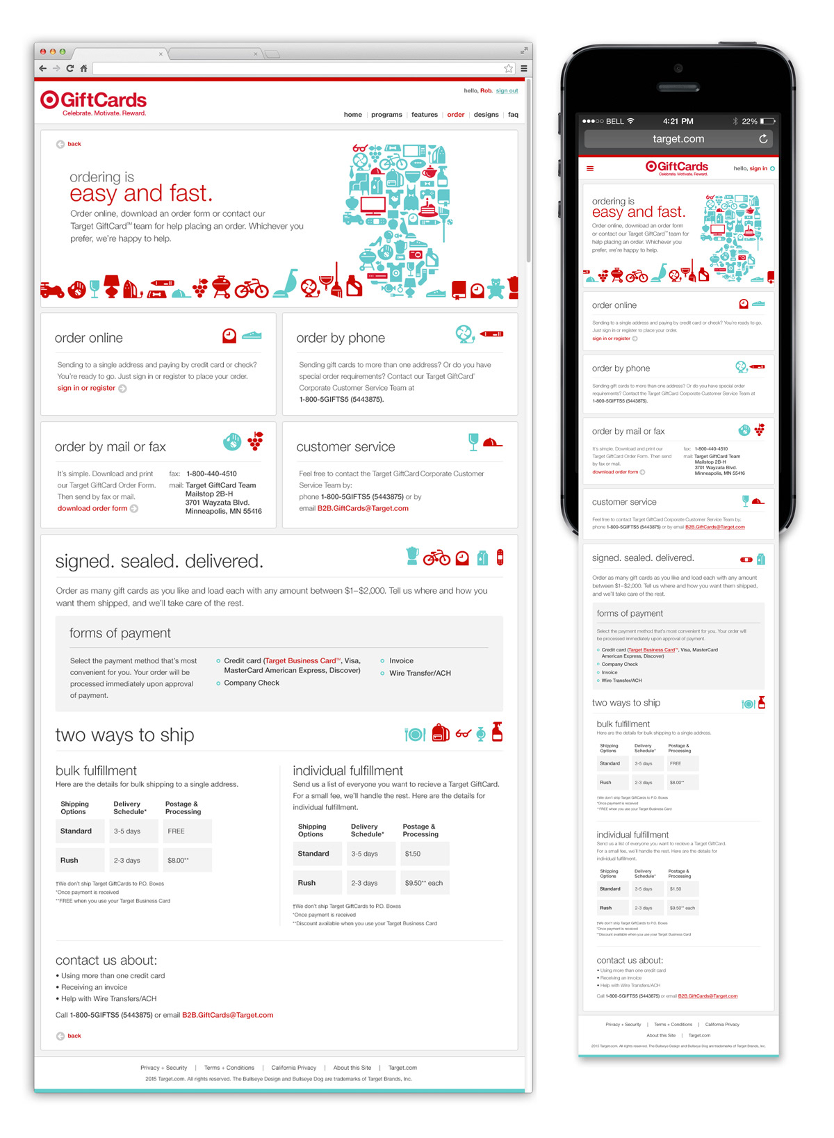
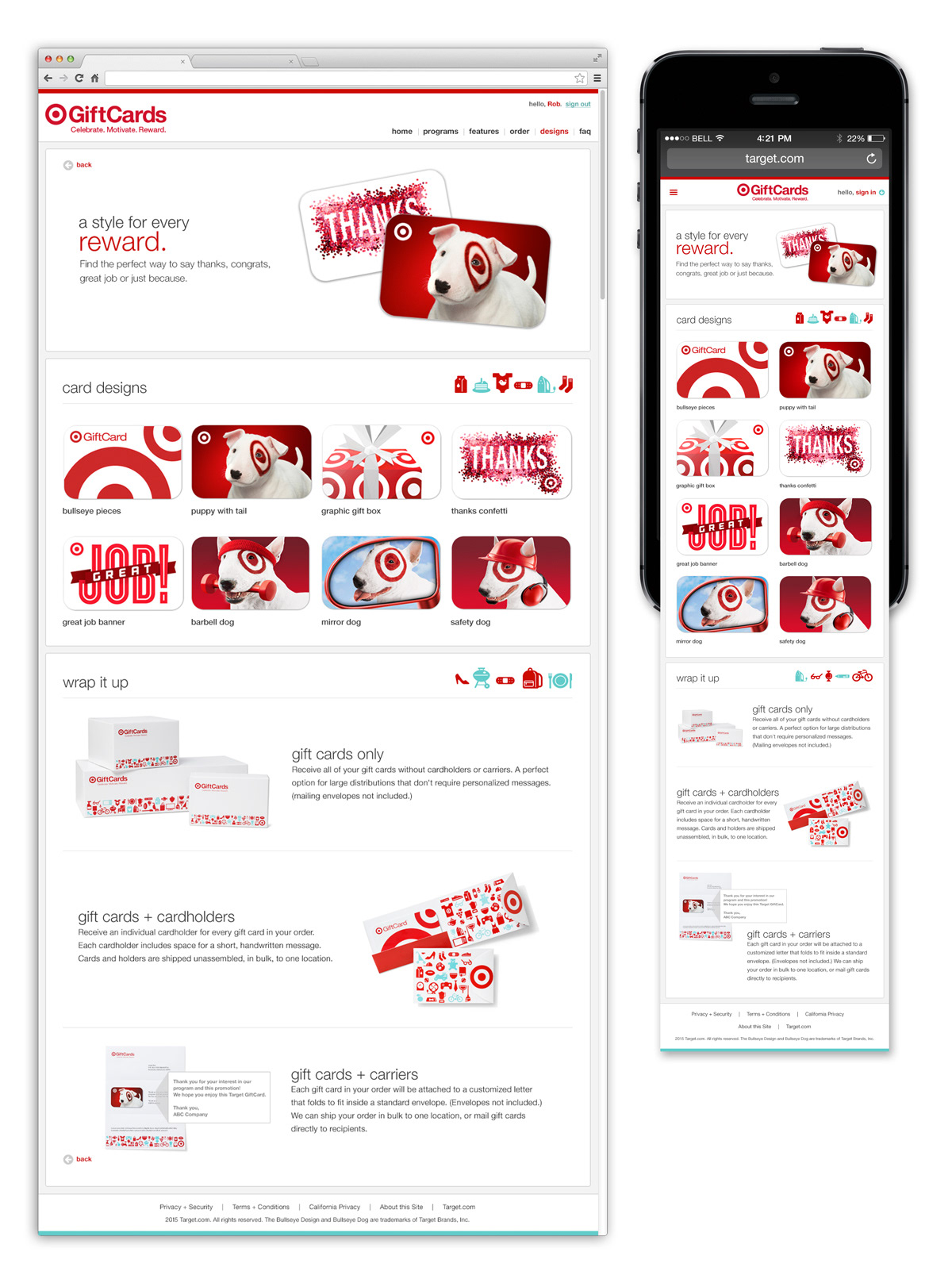
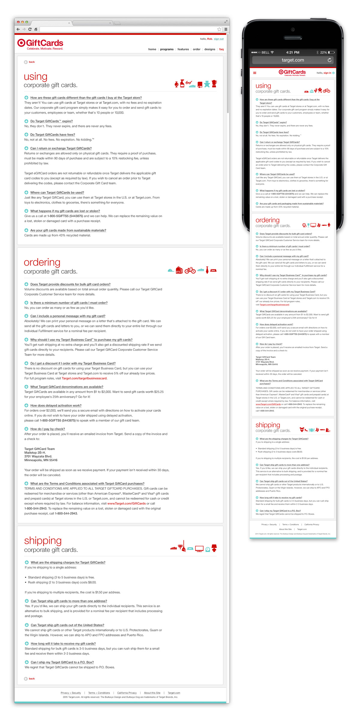
Information was simplified for the user by presenting it in smaller, easy-to-read components accompanied by fun, easily recognizable product illustrations and GiftCard designs.
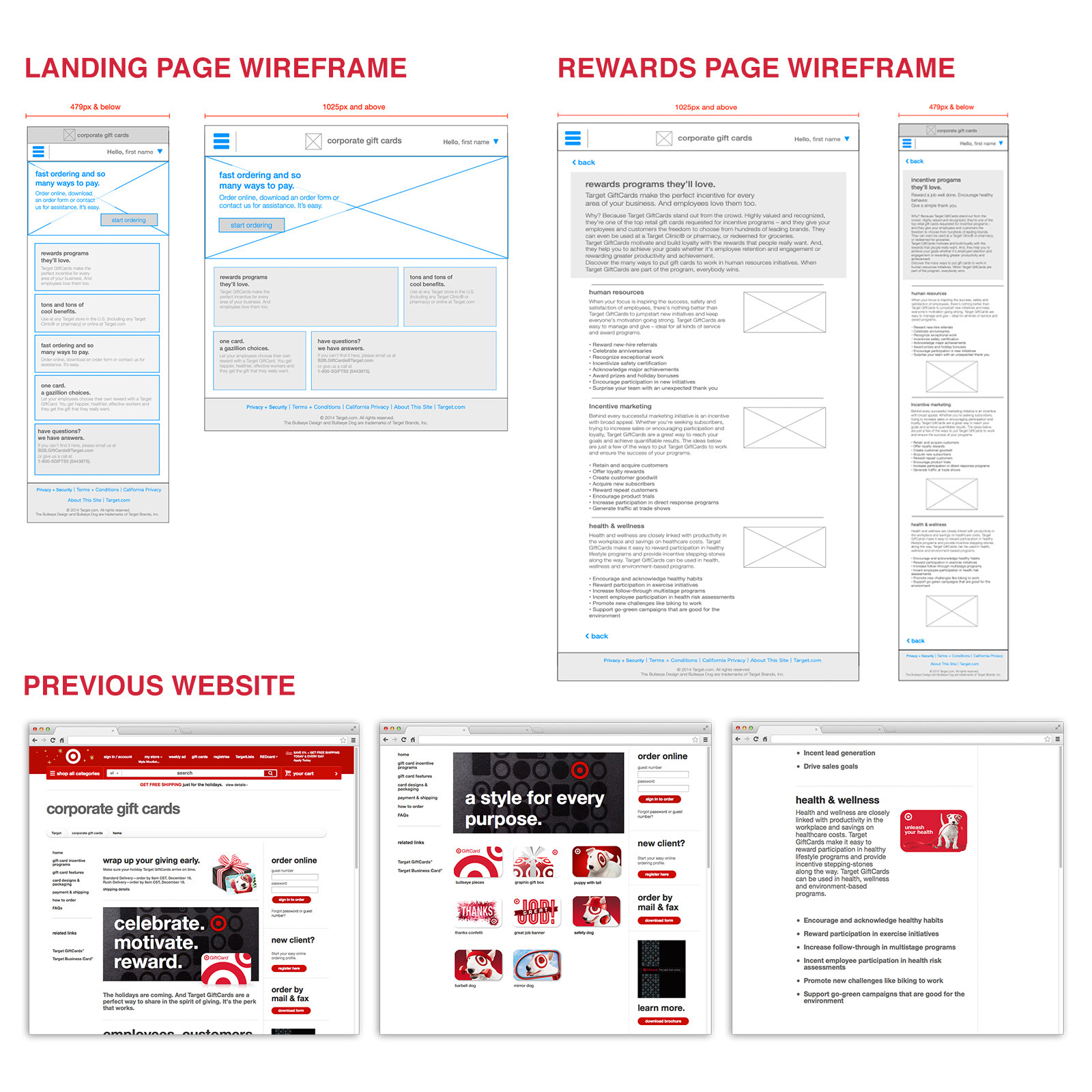
Partnering with a copywriter and an UX designer, I was the UI designer tasked with flushing out the look and feel of the website from the low-fidelity wireframes.